Engagement Report
The Engagement Report in SegMetrics shows you everything you need to understand how your existing leads interact with your marketing after they've opted in. This report focuses on the middle stage of the customer journey, helping you identify which content, emails, and touchpoints are most effective at nurturing leads and driving them toward purchase.
In this article
- Understanding the Engagement Report
- Top-line KPI metrics
- Widgets and visualizations
- Using the Ledger
- Viewing customer journeys
- Attribution models
- Data Explorer and custom reports
- Frequently Asked Questions
Understanding the Engagement Report
The Engagement Report is designed to answer critical questions about how your leads interact with your marketing:
- Which leads are actively engaging with your content?
- What emails are most effective at driving engagement and purchases?
- Which pages do engaged leads visit most frequently?
- How does engagement correlate with purchase behavior?
- What percentage of your database is actively engaged?
This report allows you to explore your data from high-level KPIs down to individual contact details, all within the same interface. You can start with aggregate metrics and drill down to see the specific people and actions that make up those numbers.
Top-line KPI Metrics
At the top of the Engagement Report, you'll see six key performance indicators that provide an at-a-glance view of your engagement performance. Each KPI shows the current value for your selected timeframe, along with a percentage comparison to the previous period.
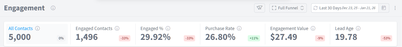
All Contacts
What it shows: The total number of contacts in your database during the selected timeframe.
Where it comes from: This counts all contacts that exist in your connected CRM or ESP integrations (such as ActiveCampaign, Drip, HubSpot, etc.) during the date range you've selected.
Why it matters: All Contacts represents your total marketing database size. This is your baseline for calculating engagement rates and understanding what percentage of your audience is actively interacting with your marketing.
Engaged Contacts
What it shows: The number of contacts who visited at least one page on your website during the selected timeframe.
Where it comes from: Engaged contacts are tracked when existing leads (people already in your CRM/ESP) visit pages on your website. The SegMetrics pixel identifies these visitors and matches them to their contact records.
Why it matters: Engaged contacts represent active interest in your business. These are people who aren't just sitting on your email list—they're taking action, visiting your site, and consuming your content. This is a critical indicator of list health and marketing effectiveness.
Engaged %
What it shows: The percentage of your total contacts who are actively engaged, calculated as Engaged Contacts ÷ All Contacts × 100.
Where it comes from: This is calculated automatically by dividing your engaged contacts by your total contacts.
Why it matters: Engagement percentage is one of the most important metrics for understanding list health. A declining engagement percentage may indicate that your list is becoming stale, your content isn't resonating, or you need to re-engage inactive subscribers. Industry benchmarks vary, but engagement rates between 20-40% are typical for healthy lists.
Purchase Rate
What it shows: The percentage of engaged contacts who made a purchase during the selected timeframe.
Where it comes from: This is calculated by dividing the number of engaged contacts who made purchases by the total number of engaged contacts (Purchasing Engaged Contacts ÷ Engaged Contacts × 100).
Why it matters: Purchase rate shows how effectively your engagement translates into revenue. A high purchase rate indicates that when people engage with your content, they're likely to buy. A low purchase rate might suggest that your content is interesting but not persuasive, or that there are barriers in your sales process.
Engagement Value
What it shows: The average revenue generated per engaged contact during the selected timeframe.
Where it comes from: This is calculated by dividing total revenue from engaged contacts by the number of engaged contacts (Revenue ÷ Engaged Contacts = Engagement Value).
Why it matters: Engagement Value helps you understand the monetary impact of keeping your audience engaged. This metric shows what each engaged lead is worth on average. You can use this to calculate the ROI of engagement-focused campaigns and content marketing efforts.
Lead Age
What it shows: The average number of days between when contacts first opted in to today
Where it comes from: For each customer, SegMetrics calculates the time between their opt-in date and today, then averages this across all customers in the timeframe.
Why it matters: Lead Age reveals how long those contacts who are engaging have been around. This helps you understand at what point after the original opt-in, do most people engage or re-engage with your brand.
Widgets and Visualizations
The Engagement Report includes several widgets that break down your performance data in different ways. Each widget provides unique insights into your engagement performance. We encourage you to select “Engaged Contacts” for best use of the timeline.
Engaged Contacts Analysis
The Engaged Contacts Analysis chart shows your engagement trends over time, comparing the current period (blue line) to the previous period (gray line).
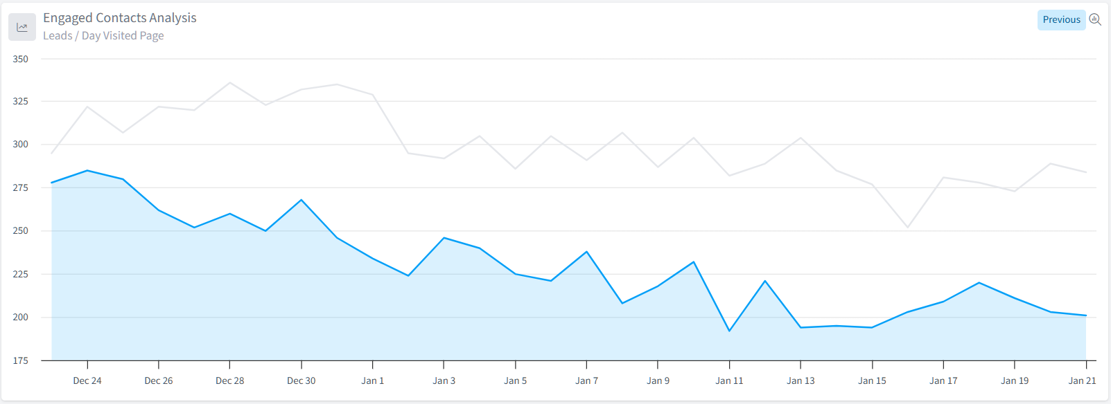
What it shows: Daily engaged contacts throughout your selected date range, with comparison data from the equivalent previous period.
How to use it:
- Hover over any point on the chart to see exact numbers for that day
- Click the tabs at the top to switch between "Previous" (comparison view), "Channel" (breakdown by traffic source), or "Other" dimensions
- Identify patterns, spikes, or drops in engagement that correlate with email campaigns, content releases, or external events
- This is where the marketing log feature can be incredibly impactful
Why it's useful: This visualization helps you spot trends and anomalies in your engagement. A sudden spike might indicate a successful email campaign or content release, while a drop could signal list fatigue, deliverability issues, or seasonal changes in your audience's behavior.
Email Performance
The Email Performance table breaks down your engagement performance by email campaign, showing which emails drive the most engagement and revenue. This only shows contacts who have opened an email and clicked on the link containing utm_medium=email
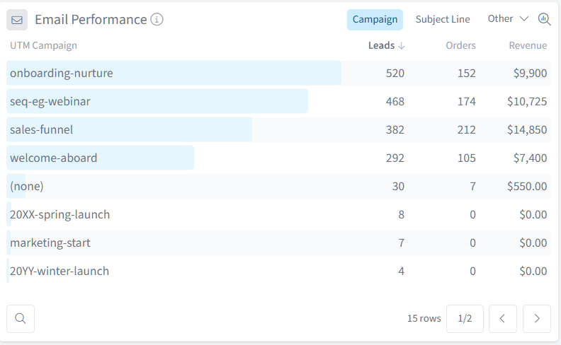
What it shows: Performance metrics broken down by email campaign or subject line.
Metrics included:
- Leads: Number of engaged contacts who opened a link within an email campaign
- Orders: Number of purchases from contacts who engaged with this email
- Revenue: Total revenue from customers who engaged with this email
How to use it:
- Click column headers to sort by any metric
- Use the dropdown at the top to switch between "Campaign", "Subject Line", or "Other" dimensions
- Click any campaign name to add it as a filter and see more detailed data
- Click the filter icon next to a campaign to drill down into that specific email
- Use the magnifying glass in the bottom left hand corner to search within the widget for a particular campaign
Why it's useful: This table identifies your highest-performing email campaigns. You can quickly see which emails drive the most engagement and revenue, helping you understand what messaging resonates with your audience. Use this to replicate successful campaigns, retire underperforming sequences, and optimize your email marketing strategy.
Web Performance
The Web Performance table shows which specific pages on your website are most effective at engaging your existing leads. This is a very effective place to look at your overall UTM engagement by selecting “other”
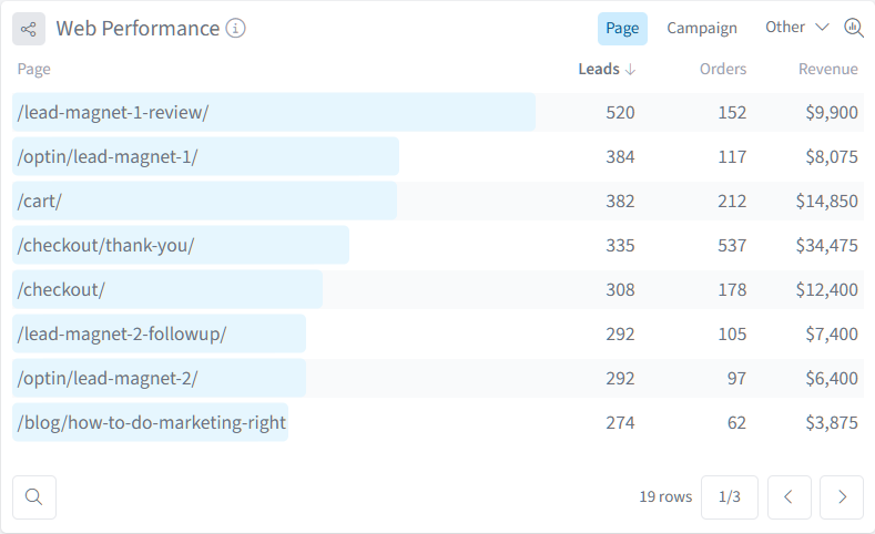
What it shows: Individual page URLs with their corresponding engaged leads, orders, and revenue metrics.
Metrics included:
- Leads: Number of engaged contacts who visited this page
- Orders: Number of purchases from contacts who visited this page
- Revenue: Total revenue from customers who visited this page
How to use it:
- Use the pagination controls at the bottom to browse through all pages
- Switch between "Page", "Campaign", or "Other" views using the dropdown
- By selecting “Other” you can see all other UTM engagement options i.e. “source” “campaign” “content” etc.
- Click any page URL to filter the entire report to just that page
- Identify your most engaging content and conversion-driving pages
- Use the magnifying glass in the bottom left hand corner to search within the widget for a particular page
Why it's useful: This table reveals which content pieces are most effective at re-engaging your existing leads and driving them toward purchase. You can identify high-value content that moves leads closer to buying, optimize pages that get traffic but don't convert, and understand what topics interest your engaged audience most.
Lead Value Velocity
The Lead Value Velocity widget shows how the average value of your leads grows over time as they engage with your marketing.
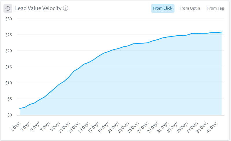
What it shows: A cumulative chart displaying how average lead value increases from the initial touchpoint through their journey with your business.
How to read it:
- X-axis: Days since the initial touchpoint (click, opt-in, or tag)
- Y-axis: Average cumulative revenue per lead
- The curve: Shows how value accumulates over time
- Tabs: Switch between "From Click", "From Optin", or "From Tag" to see velocity from different starting points
How to use it:
- Identify how long it typically takes for leads to generate revenue
- Spot acceleration or deceleration points in the value curve
- Compare different cohorts by using filters
- Understand the long-term value trajectory of your leads
- Set realistic expectations for campaign ROI timeframes
Why it's useful: Lead Value Velocity reveals the time-to-value for your marketing efforts. You can see exactly when leads start generating revenue and how quickly that value grows. This helps you understand whether your nurture sequences are the right length, identify the optimal time to make offers, and demonstrate the long-term value of your marketing investments.
Customer Journey
The Customer Journey widget visualizes how your contacts progress through different stages of awareness and engagement.
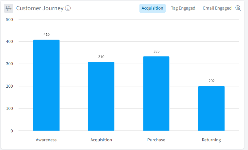
What it shows: A bar chart displaying the number of contacts at each stage of the customer journey.
Journey stages:
- Awareness: Contacts who have engaged with your brand through multiple touchpoints
- Acquisition: Contacts who have taken significant actions showing purchase intent
- Purchase: Contacts who have made their first purchase
- Returning: Contacts who have made multiple purchases
How to use it:
- Toggle between "Acquisition", "Tag Engaged", or "Email Engaged" views using the tabs
- Hover over any bar to see exact contact counts
- Identify where contacts accumulate or drop off in the journey
- Click any stage to filter the entire report to contacts in that stage
Why it's useful: This visualization helps you understand how your audience moves through their relationship with your business. You can identify stages where contacts get stuck, measure the effectiveness of your journey progression strategies, and understand what percentage of engaged leads convert to customers and then to repeat buyers.
Using the Ledger
One of SegMetrics' core principles is trust in your data. The Ledger feature ensures you can verify every metric by showing the individual data entries that make up any number.

How to access the Ledger:
- Either select a top line metric or scroll down to any widget in the Engagement Report
- Click the number of any KPI metric (like "Engaged Contacts" or "Orders")
- The Ledger window opens, displaying all individual records included in that metric
What the Ledger shows:
- Individual contact information (name, email)
- Relevant data for the metric you clicked (page visits, order IDs, amounts, dates)
- Active filters at the top showing what's included in this view
- Pagination controls if there are many records
Why it's useful: The Ledger provides complete transparency into your data. You can verify metrics, identify specific contacts for follow-up, export lists for targeted campaigns, or troubleshoot data discrepancies. For example, you might open the ledger for a specific email campaign to export a list of engaged contacts for a special offer.
Viewing Customer Journeys
Sometimes aggregate data only tells part of the story. The Customer Journey feature lets you view the complete timeline of actions for any individual contact.
How to access Customer Journeys:
- Click any people metric in a table (like "Leads" or "Orders")
- The Ledger opens showing individual contacts
- Click on any email address in the Ledger
- The Customer Journey window opens for that contact

What the Customer Journey shows:
- Every page view with timestamps
- All email opens and clicks
- Tag additions and list subscriptions
- Form submissions and opt-ins
- Purchases and order details
- Custom attributes and field updates
Why it's useful: Customer Journeys help you understand the complete path a person took through your marketing. You can see exactly which emails they opened, which pages they visited, and what actions led them to purchase (or why they haven't purchased yet). This is invaluable for optimizing your engagement sequences, troubleshooting why specific contacts aren't converting, and providing personalized customer service.
Attribution Models
Attribution models determine how SegMetrics assigns credit for conversions across different marketing touchpoints. The Engagement Report supports four attribution models that can be changed at any time.
You can select between attribution models next to the date range in the top right hand corner of the report.

Full Funnel
How it works: Allocates 100% credit across all touchpoints in the customer journey. If someone interacted with three different emails and pages before converting, each touchpoint receives credit.
When to use it: Use Full Funnel when you want to understand the complete picture of which engagement activities contributed to conversions. This model shows you every touchpoint that played a role.
What it means for reporting: Conversions will appear for multiple emails and pages because each touchpoint receives credit. The total across all touchpoints will exceed your actual conversion count.
First Engagement
How it works: Gives 100% credit to the first engagement touchpoint within your report's timeframe.
When to use it: Use First Engagement when you want to understand what re-activated leads within a specific period. This is perfect for measuring re-engagement campaigns or identifying what brings dormant leads back to your site.
What it means for reporting: Only the first touchpoint a contact had (within your date range) receives credit. This helps identify which emails or content pieces are best at starting conversations with existing leads.
First Click
How it works: Gives 100% credit to the very first touchpoint that led to customer acquisition, regardless of when it occurred.
When to use it: Use First Click in the Engagement Report when you want to understand the original source that brought your now-engaged leads into your business. This helps you connect current engagement back to acquisition sources.
What it means for reporting: The channel or campaign that first brought someone to your business gets all the credit. This is less commonly used in the Engagement Report but useful for attribution analysis.
Last Touch
How it works: Gives 100% credit to the last touchpoint before a purchase.
When to use it: Use Last Touch when you want to understand what final piece of engagement convinced leads to buy. This is ideal for identifying your highest-converting emails and pages.
What it means for reporting: Only the final interaction before purchase receives credit. This helps identify which engagement activities are best at closing sales. Note that this can frequently be dominated by checkout pages or final sales emails.
How Filters Affect Attribution Models
Standard filters are applied BEFORE the attribution model calculates credit. For example, if you filter to only show a specific email campaign, the attribution model will only consider that campaign's touchpoints when assigning credit, even if other touchpoints were involved in the journey.
To filter AFTER attribution is calculated, use Attribution Model Filters (click the XX icon in tables instead of the filter icon).
Data Explorer and Custom Reports
While the Engagement Report provides powerful pre-built analysis, the Data Explorer allows you to create and save completely custom reports with your own metrics, dimensions, and visualizations.
Accessing the Data Explorer:
- Click the "explore" icon in the top right of any widget
- Or navigate to "Reports" in the left sidebar

What you can do:
- Select any data source (Acquisition, Engagement, Orders, Subscriptions, etc.)
- Choose from dozens of metrics and dimensions
- Create custom visualizations (tables, charts, graphs)
- Save reports for future reference
- Share reports with team members
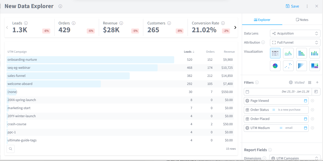
Note: A separate, comprehensive guide on using the Data Explorer is available. The Data Explorer provides advanced functionality for users who need analysis beyond the pre-built Engagement Report.
Frequently Asked Questions
Q: What counts as an "engaged contact"?
A: An engaged contact is any existing lead (someone already in your CRM/ESP) who visited at least one page on your website during the selected timeframe. Simply being on your email list doesn't count as engaged—they need to take action by visiting your site.
Q: Why don't I see some of my email campaigns in the Email Performance widget?
A: Email campaigns will only appear if engaged contacts interacted with them during your selected timeframe. If a campaign was sent but no one visited your website after receiving it, it won't appear in this report. Additionally, ensure your email campaigns are properly tagged with UTM parameters for accurate tracking. You must have utm_medium=email in order for the attribution to appear in your email performance widget.
Q: Can I see engagement from social media or other channels?
A: Yes! The Engaged Contacts Analysis chart can be broken down by channel using the dropdown menu. This will show you which traffic sources (email, social, paid, organic, etc.) are driving the most engagement from your existing leads.
Q: What should I do with highly engaged leads who haven't purchased?
A: Highly engaged leads who haven't purchased yet are gold—they're interested but need something to push them over the edge. Consider sending them a special offer or discount, reaching out personally to ask what questions they have, ensuring they're aware of all your product options, checking if there are technical issues preventing purchase, or using retargeting ads to stay top of mind.